


Table of Contents
Google’s guidelines state that websites should be responsive (mobile-friendly), meaning they look good on any device. Is your website mobile-friendly? Check your website’s UX score and performance here.
If your score is not great, try out some of our tips below. However, we suggest you consult a top custom mobile app development company.
With the right team by your side, you can create a mobile-friendly version of your website that attracts more customers and increases your profits.
Here’s How You Can Uplift User Experience on a Mobile Website
Consider the following ways to uplift your mobile website’s user experience.
1. Use Responsive Design
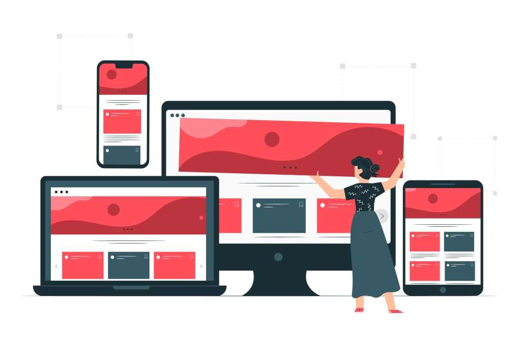
Responsive web design (RWD) is becoming increasingly popular among designers and developers. RWD allows your website to look fabulous no matter what type of device someone uses to view the page.
Use flexible layouts and grids that adjust based on the screen size. And, utilize media queries to target specific styles for different devices.
2. Allow Users to Navigate Easily
Users shouldn’t struggle to navigate your site. Keep navigation bars small and straightforward. Use text links and icons. They improve readability and usability on small screens, making them easier to click.
Also, consider implementing a swipe navigation system to allow users to quickly and easily navigate between pages on your mobile website.
3. Create a User-friendly Interface
Your website should be easy to use. Users should immediately understand how to get where they want to go. Remove unnecessary features, and focus on providing the best possible experience.
Searching for something specific on your site should be quick and painless. Include a search bar that makes finding information easy and fast.
4. Use Crisp, Clear Fonts/Texts
By making sure your website’s text is easy to read on a mobile device, you can ensure that your readers will have a positive experience.
As per top custom app development companies, website owners should consider these things when optimizing text for mobile reading.
- First, use short paragraphs and sentences. Mobile readers are more likely to skim than read deeply, so ensure your content is easy to scan.
- Second, use clear and concise language. Avoid jargon or overly technical terms that might be confusing to mobile readers.
- Third, use typography that is easy to read on a small screen. Try to use sans serif fonts such as Arial or Helvetica, and avoid using multiple fonts or colors within the same piece of text.
5. Optimize Your Loading Time
No one likes to wait for a website to load, especially on mobile devices. Slow loading times can be frustrating and may even cause users to abandon your site altogether. Fortunately, there are ways to speed up your mobile website and improve the user experience. You can do the following to improve your website’s speed.
- First, look at your website’s code and compress any larger files than necessary. This will help reduce loading times, especially on slower connections.
- Another tried and tested way to speed up your site is to use a content delivery network (CDN). A CDN caches your website’s files on servers worldwide so that users can access them more quickly, regardless of their location.
- Finally, consider using accelerated mobile pages (AMP). AMP is a Google-backed initiative that allows you to create stripped-down versions of your web pages that load almost instantaneously on mobile devices.
Implementing these tips could be tricky if you aren’t familiar with coding. Consider hiring a developer from one of the top custom mobile app development company.
6. Make Links Tap Targets
Links are essential for any website, but they can be especially troublesome on mobile devices. Small screen sizes and touch-based input make it difficult for users to click on links, resulting in a frustrating experience.
Ensure the links on your mobile website are as user-friendly as possible on mobile devices by following the points mentioned below:
- Make sure the link text is easy to read, and tap
- Use larger tap targets
- Place links further apart
7. Compress Images
Images are essential elements on a website and can significantly impact page loading times. When optimizing images for mobile devices, compress them without sacrificing quality.
There are several ways to compress images, including using lossless compression algorithms or removing EXIF data. In most cases, JPEG compression will result in the smallest file size with minimal quality loss.
8. Employ Progressive Disclosure
Progressive disclosure is a technique used in mobile UX design to help users focus on one task at a time. It does this by hiding less important information until the user needs it.
In general, it can simplify and organize complex information, making it easier for users to find what they need and understand what they are looking at. Additionally, it can help prevent users from becoming overwhelmed or confused by too much information.
9. Factor in Zoom Options for Larger Pages
Zoom Options is a great way to make your website more user-friendly for mobile devices. A website with large pages can be difficult to view on a small screen; consider zoom options for users to enlarge the text and images. It will allow users to zoom in on specific areas of a page, making it easier to read texts and see images.
10. Social Media Integration
Social media is such a powerful tool for website owners. It is a great way to communicate directly with consumers and create awareness about your brand. Additionally, Integrating social media elements like comments, likes, shares, and retweets increases engagement and encourages visitors to interact with your content.
Final Words
Want to create a mobile-friendly version of your website but don’t know where to start? Maybe it’s time you hire a custom mobile app development company.
With expert developers, you can improve your website’s usability and make it mobile-ready within time and budget.

